Summer sale discount off 50%! Shop Now
Choosing Bag Leather For Color Saturation And Depth: How Hermès Leather Finish Affects Color Intensity
Dec 23, 2025
By
Sophia Whitmore
0 comment(s)
Introduction: Why Leather Choice Changes Color More Than You Think
When shopping for an Hermès bag, most people start with color. Gold or Etoupe. Rouge H or Rouge Casaque. Bleu Nuit or Blue Jean. Color feels like the emotional decision, the part that makes your heart race.
Leather often comes second, treated as a technical detail or a question of durability. But in reality, leather choice has just as much influence on how a color looks as the color itself.
Two bags made in the exact same shade can look surprisingly different once leather enters the equation. One may appear rich, bold, and intense. The other may feel soft, airy, or almost faded. Neither is wrong, but they send very different messages.
This guide focuses on how Hermès bag leathers affect color saturation and depth. We will explore why some leathers amplify color, why others soften it, and how surface finish changes the way your eye reads tone. By the end, you should be able to choose a leather that makes your chosen color look the way you expect, not just online, but in real life.
What “Color Saturation” And “Color Depth” Actually Mean
Before comparing leathers, it helps to define a few terms that are often used loosely.
Color saturation describes how vivid or intense a color appears. Highly saturated colors feel bold and energetic. Lower saturation creates softer, more powdery, or pastel effects.
Color depth refers to how rich and dimensional a color looks. A deep color often feels darker, denser, and more layered, especially when lighting changes.
Hermès controls both through tanning methods, dye absorption, grain structure, and surface finish. The same dye behaves very differently depending on whether it sits on top of the leather or sinks deeply into the fibers.
Why Leather Structure Has Such A Big Impact On Color
Leather is not a flat canvas. It is a material with pores, grain, and thickness, all of which affect how dye behaves.
Leathers with a tight grain and smoother surface tend to reflect more light. Reflection sharpens color edges and increases perceived saturation.
Leathers with a pronounced grain or matte finish scatter light instead. This diffusion softens color and reduces contrast, even when the dye concentration is the same.
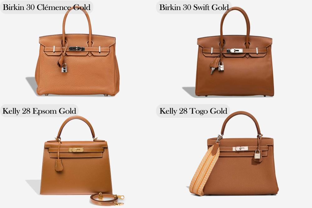
Thickness also plays a role. Thicker leathers can absorb more dye, often creating darker, deeper tones, especially in browns, reds, and blues.
Understanding this makes it easier to predict how a color will translate from one leather to another.
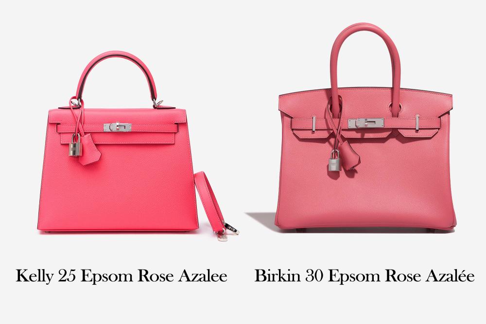
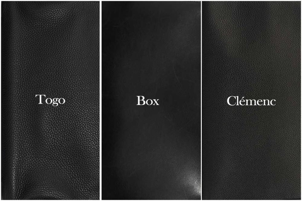
Epsom: Clean Structure With Clear Color Definition
Epsom is one of the most recognizable Hermès leathers. It is stamped, lightweight, and holds a very defined shape. The surface has a fine crosshatch texture that feels crisp rather than organic.
Because Epsom is treated and coated, dye does not penetrate deeply into the leather. Instead, it sits closer to the surface, which keeps color controlled and consistent.
How color looks in Epsom
- Medium to high saturation
- Clean, precise tone
- Slightly lighter appearance than softer leathers
Bright colors such as Rose Azalée, Bleu Hydra, and Orange Poppy look fresh and graphic in Epsom. Pastels stay pale and airy rather than creamy or chalky.
Epsom does not create the richest depth, but it excels at clarity. If you want a color to look neat, modern, and predictable over time, Epsom is a safe and reliable choice.
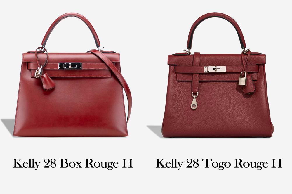
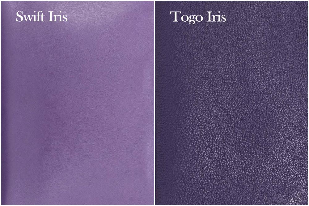
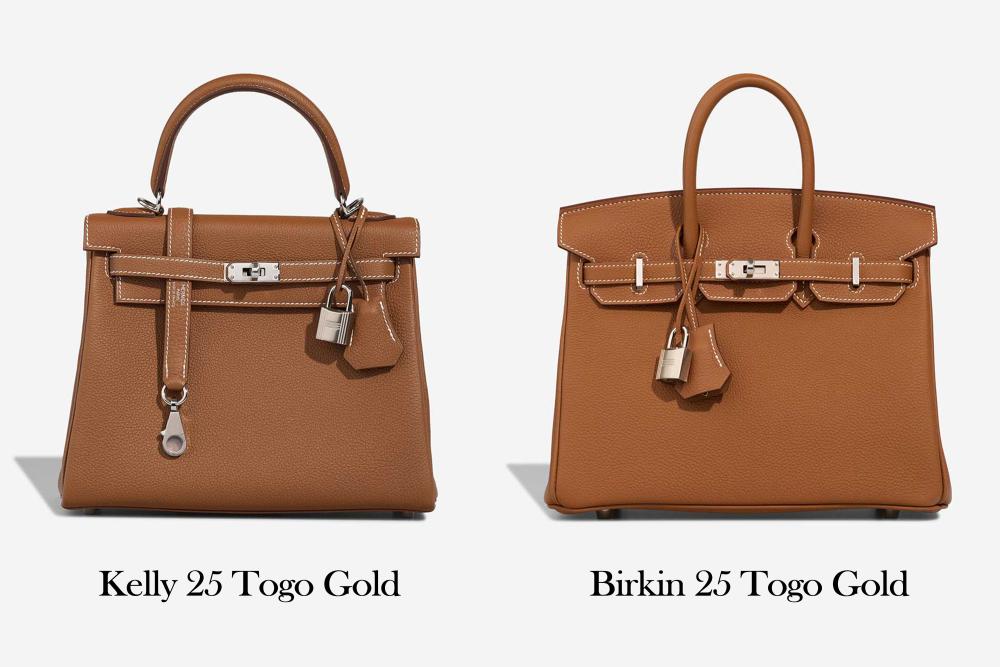
Togo: Natural Grain With Balanced Color Depth
Togo is one of the most popular Hermès leathers for good reason, especially on the Birkin and Kelly. It has visible grain, moderate structure, and a semi matte finish that feels neither stiff nor slouchy.
Togo absorbs dye more deeply than Epsom. The natural grain creates subtle shadows across the surface, which adds dimension and warmth.
How color looks in Togo
- Medium saturation
- Noticeable depth and richness
- Slightly muted compared to smooth leathers
Neutrals like Gold, Etoupe, and Etain feel especially balanced in Togo. Blues gain softness without losing character. Reds appear elegant rather than sharp.
Togo is ideal for buyers who want color to feel luxurious and natural, not flat but not loud either.
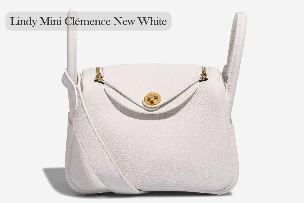
Clemence: Relaxed Texture With Softened Color
Clemence is heavier, thicker, and more flexible than Togo. It has a larger grain and a very matte surface, which gives it a casual, lived in feel.
Because Clemence absorbs dye deeply and reflects little light, colors often appear darker but less saturated.
How color looks in Clemence
- Lower saturation
- Deep but subdued tone
- Soft, powdery effect in light shades
Light colors such as Craie, Nata, and Gris Perle look creamy and relaxed in Clemence. Bright shades lose intensity and feel more understated.
If you prefer a bag that looks effortless and relaxed rather than crisp or polished, Clemence supports that mood beautifully, especially on larger styles like the Birkin 30.
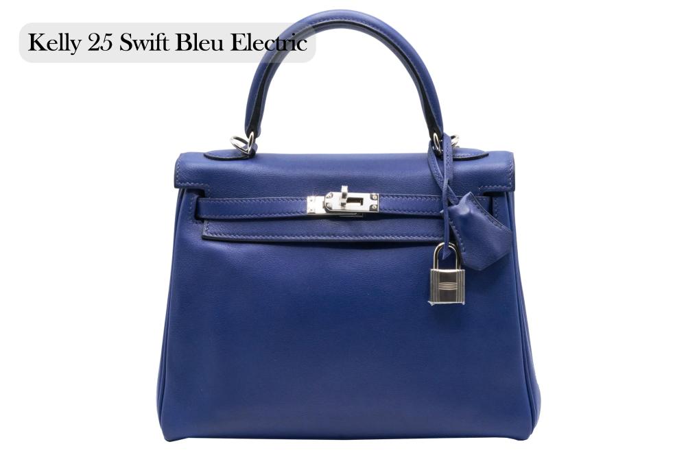
Swift: Smooth Finish With Strong Color Impact
Swift is a smooth, fine grained leather with a soft hand feel. Unlike Epsom, it is not stamped, and unlike Clemence, it has minimal visible grain.
This smoothness allows dye to appear very clearly on the surface, which boosts saturation.
How color looks in Swift
- High saturation
- Bright, vivid appearance
- Noticeable shifts under different lighting
Colors like Rouge Casaque, Blue Electric, and Vert Vertigo look bold and expressive in Swift. Even darker shades appear brighter than they do in grained leathers.
Swift is ideal when color is the star of the bag and you want it to stand out, particularly on smaller pieces such as the Constance.
Box Calf: Polished Surface With Dramatic Depth
Box calf is one of Hermès’ most traditional leathers. It is smooth, firm, and polished, with a surface that reflects light strongly.
Dye penetrates deeply into box calf, but the polished surface intensifies contrast, creating dramatic depth.
If you want to know more about Hermès, visit our Hermès blog.
How color looks in box calf
- High saturation
- Very deep, weighty tone
- Strong contrast in different lighting
Black looks inky and formal. Reds feel darker and more serious. Even neutral browns gain presence and authority.
Box calf is best for buyers who want a timeless, elegant color with a strong visual impact.
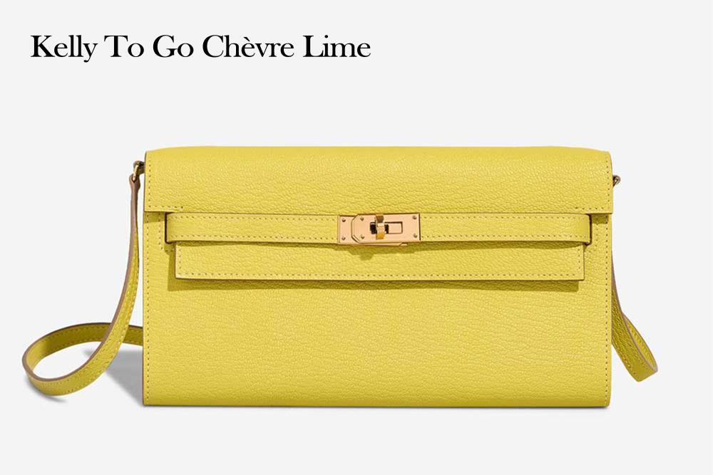
Chevre: Fine Grain With Luminous Color
Chevre is a goatskin leather known for its durability and subtle sheen. It has a fine, natural grain that holds dye extremely well.
Because Chevre reflects light while still absorbing dye deeply, it produces some of the most vibrant colors in the Hermès lineup.
How color looks in Chevre
- High saturation
- Bright, luminous appearance
- Slightly more vivid than Swift
Colors such as Mykonos, Lime, and Rose Pourpre look crisp and joyful. Even pale shades feel clear rather than dusty.
Chevre is an excellent choice if you want strong color without sacrificing durability.
Evercolor And Evergrain: Controlled Color With Modern Finish
Evercolor and Evergrain are treated calfskins with smooth or lightly grained surfaces. They sit between Epsom and Swift in behavior.
How color looks in Evercolor and Evergrain
- Medium to high saturation
- Even, controlled appearance
- Slight softness compared to Swift
These leathers work well for contemporary colors and modern neutrals, especially when you want consistency without rigidity.
Doblis And Suede: Soft Focus And Mood Over Precision
Doblis and other suede leathers absorb dye deeply but scatter light heavily due to their nap.
How color looks in Doblis
- Low saturation
- Velvety, muted tone
- Strong depth in darker shades
Bright colors become toned down. Pastels look dusty and romantic. Doblis is less about color accuracy and more about atmosphere.
How Lighting Changes Color Across Different Leathers
Lighting dramatically affects how leather color appears.
Glossy leathers such as box calf and Chevre look brighter in daylight and darker indoors. Matte leathers like Clemence stay more consistent but can appear flatter in low light.
This is why the same bag can feel different depending on where you carry it.
If you want to know more about Hermès fashion, you can visit our Hermès blog.
Choosing Leather Based On Color Family
Bright colors
Swift, Chevre, and Epsom keep them vivid and energetic.
Pastels
Clemence and Togo soften them. Swift keeps them crisp.
Neutrals
Togo and Epsom offer balance. Box calf adds formality.
Dark shades
Box calf, Togo, and Clemence enhance depth. Swift adds brightness.
Matching Leather Choice To Your Personal Style
Structured wardrobes pair well with Epsom and box calf. Relaxed wardrobes feel more natural with Clemence and Togo. Statement dressers often gravitate toward Swift and Chevre.
Leather quietly reinforces the overall impression your bag makes.
Common Mistakes When Choosing Color And Leather
A frequent mistake is choosing a color based solely on photos without considering leather. A shade that looks perfect in Swift may feel disappointing in Clemence.
Another mistake is assuming darker automatically means richer. In very matte leathers, dark colors can look flat rather than deep.
Always think about finish, texture, and light.
Final Thoughts: Let Leather Shape The Color Story
Hermès colors are carefully developed, but leather determines how those colors live in the real world. Saturation, depth, and softness are not random. They are shaped by structure, finish, and dye behavior.
Choosing the right leather ensures your bag looks the way you imagine, not just once, but every time you carry it.
When color matters, leather is not a secondary choice. It is the final filter that defines everything.