Summer sale discount off 50%! Shop Now
How To Photograph Hermes Bags True To Color: A Practical Guide for Accurate Leather Photography
Jan 26, 2026
By
Sophia Whitmore
0 comment(s)
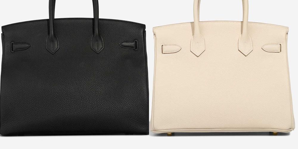
Photographing a Hermès bag accurately is harder than it looks. Even experienced sellers and collectors struggle to capture the true color of the leather. A Gold Birkin can turn pumpkin orange. Etoupe can read flat gray. Rouge H may look brown in one photo and cherry red in another. When color shifts like this, it creates confusion, mistrust, and sometimes costly mistakes.
If you are photographing a Hermès bag for personal records, resale listings, insurance documentation, or long-term collection management, color accuracy matters just as much as sharpness or styling. These bags are defined by subtle color differences, nuanced undertones, and natural variation in leather. Your photos should reflect that reality, not fight against it.
This guide explains how to photograph Hermès bags so the color and texture appear as close to real life as possible. You do not need a professional studio, expensive lighting, or advanced technical skills. What you need is a controlled setup, thoughtful choices, and an understanding of how cameras interpret color. Once you learn the basics, you can repeat the same process every time and get consistent, trustworthy results.
Why True Color Is Especially Important for Hermès Bags
Color accuracy matters for any product photography, but it is especially critical with Hermès.
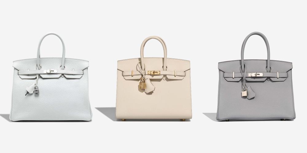
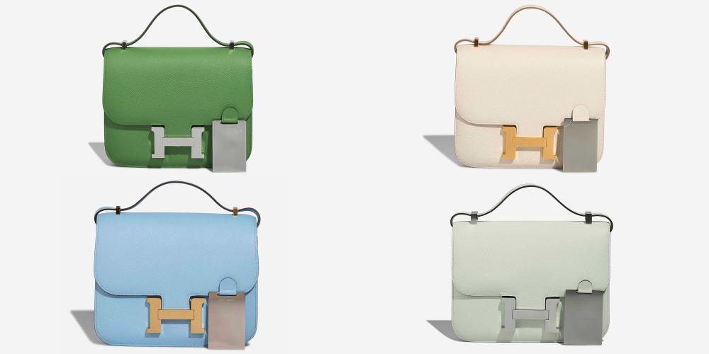
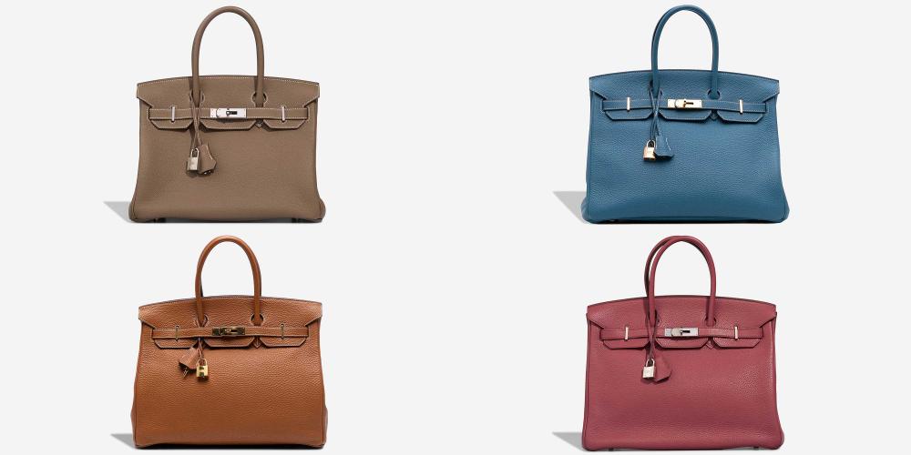
Hermès colors are not generic. Many shades sit between obvious color categories. Etoupe is neither gray nor brown. Gold changes depending on light and wear. Rose Sakura looks very different from Rose Confetti, even though both are pale pinks. Collectors and buyers often search for a specific shade, not just a general color family.
Accurate photos help in several practical ways:
- They create reliable documentation for insurance purposes
- They reduce questions and disputes in resale transactions
- They help buyers compare bags across listings
- They allow you to track patina and wear over time
- They build trust if you sell regularly
Inaccurate color photos can lead to returns, payment disputes, or accusations of misrepresentation, even when the mistake was unintentional. Clear, honest photography protects both the seller and the buyer.
Why Hermès Bag Colors Are Hard to Photograph
Before diving into solutions, it helps to understand why color accuracy is so challenging with Hermès leather.
Leather Reflects Light Differently Than Fabric
Hermès leather has natural oils, grain, and finish that reflect light unevenly. This reflection can brighten highlights and deepen shadows, making the color look lighter or darker depending on the angle.
Many Colors Have Strong Undertones
A bag may look beige in one room and olive in another because the undertones respond to light temperature. Cameras exaggerate these shifts more than the human eye does.
Cameras Guess More Than You Realize
When a camera is set to automatic mode, it constantly guesses what white looks like, how bright the scene should be, and how much contrast to apply. With a complex object like a Hermès bag, those guesses are often wrong.
Understanding these challenges makes it easier to control them.
Lighting Is the Foundation of Color Accuracy
If there is one thing to get right, it is lighting. No amount of editing can fix bad light.
Use Natural, Indirect Daylight Whenever Possible
The most reliable light source is natural daylight that is not hitting the bag directly. A window with indirect light provides even illumination without harsh shadows.
The best conditions are:
- Late morning to early afternoon
- Bright but overcast days
- North-facing windows if available
Place the bag a few feet away from the window so the light wraps around it rather than striking it sharply.
Avoid Direct Sunlight
Direct sun creates:
- Blown-out highlights
- Deep, hard shadows
- Color shifts that exaggerate warmth
Even a few minutes of direct sun can dramatically alter how a bag photographs, especially lighter colors.
Be Careful With Artificial Lighting
Indoor lighting is one of the biggest causes of inaccurate color.
Common issues include:
- Yellow casts from tungsten bulbs
- Green casts from fluorescent lighting
- Inconsistent color temperature from LEDs
If you must use artificial light, use two identical daylight-balanced lights placed at equal angles on each side of the bag. Never mix artificial light with window light. Mixed lighting confuses white balance and produces unpredictable color.
The Role of Background in Color Accuracy
Background choice affects how your camera interprets exposure and color, even if it seems neutral to your eye.
Choose Soft, Neutral Backgrounds
Good background options include:
- Light gray fabric or board
- Soft beige or cream
- Neutral taupe without strong undertones
These colors help the camera balance exposure without pulling color from the bag.
Avoid Bright White Backgrounds
Bright white backgrounds often cause the camera to darken the subject to compensate. This can make leather look deeper, duller, or more saturated than it really is.
Avoid Dark or Colored Surfaces
Black backgrounds absorb light and exaggerate contrast. Colored surfaces reflect onto the leather, subtly altering its tone. Even natural wood can introduce warm or red undertones.
Use Matte Surfaces Only
Glossy surfaces reflect light and surrounding colors. Matte surfaces keep attention on the bag and reduce unwanted reflections.
Choosing Between Flat Lay and Upright Photos
Different angles serve different purposes, and most complete photo sets include both.
Flat lay photography is ideal for capturing true color evenly and is commonly used in resale listings and documentation.
Upright photography helps show structure and how color varies across panels, especially when comparing different Birkin sizes.
Flat Lay Photography
Flat lays are ideal for:
- Capturing true color evenly
- Showing the full shape of the bag
- Creating clean, consistent documentation
Place the bag flat on its back, arrange the handles naturally, and photograph from directly overhead. Keep the camera parallel to the surface to avoid distortion.
Flat lays are especially useful for resale listings because they give buyers a clear, unbiased view of the color.
Upright Photography
Upright photos show:
- Structure and depth
- Side panels and gussets
- How color varies across different leather panels
Set the bag on a neutral surface and position the camera at the bag’s mid-height. Avoid shooting from above, which can darken the front panel and skew color.
Phone vs Camera: What Really Matters
Both smartphones and dedicated cameras can produce accurate results if used correctly.
Using a Smartphone Effectively
Modern smartphones apply aggressive processing by default. To minimize distortion:
- Turn off portrait mode and filters
- Avoid HDR unless necessary
- Tap to lock focus and exposure
- Slightly lower exposure if highlights look blown
If your phone has a Pro or Manual mode, use it. Shooting in RAW format preserves color data and allows more precise editing later.
Using a DSLR or Mirrorless Camera
A dedicated camera offers more control, but it is not required.
Helpful tips:
- Shoot in RAW
- Use a standard lens (35mm to 50mm equivalent)
- Avoid wide-angle lenses
- Use a tripod for consistency
The key advantage of a camera is predictability, not automatic improvement.
White Balance: The Step Most People Skip
White balance tells your camera what “neutral” looks like under your lighting conditions.
Avoid Auto White Balance
Auto white balance shifts from shot to shot, especially if the bag fills most of the frame. This leads to inconsistent color across photos.
Set White Balance to Daylight
If shooting in daylight, manually set white balance to daylight. This prevents warm or cool color drift.
Use a Gray Card for Best Results
A gray card is one of the simplest and most powerful tools for color accuracy.
How to use it:
- Place the gray card next to the bag
- Take one reference photo
- Remove the card and shoot normally
- Use the reference photo to correct white balance in editing
This step is especially helpful for difficult shades like Etoupe, Gold, and Gris Tourterelle.
Exposure, Contrast, and Saturation
Hermès leather benefits from gentle handling in camera settings.
Slight Underexposure Is Better Than Overexposure
Underexposing slightly preserves highlights and prevents washed-out color. Overexposed leather loses depth and looks flat.
Keep Contrast Low to Moderate
High contrast exaggerates grain and darkens creases unnaturally. Hermès leather should look supple, not harsh.
Leave Saturation Alone
Do not increase saturation. If the color looks dull, the issue is lighting, not saturation. Hermès colors are naturally rich when photographed correctly.
If you want to know more about Hermès fashion, you can visit our Hermès blog.
Capturing Texture Without Distorting Color
Texture adds realism, but it should not overpower color accuracy.
- Use gentle side lighting to reveal grain
- Avoid harsh shadows
- Take one close-up detail shot
The close-up should confirm texture, not make the leather appear darker or more dramatic than it is in person.
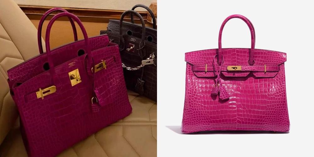
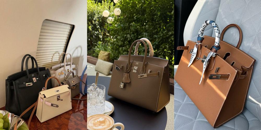
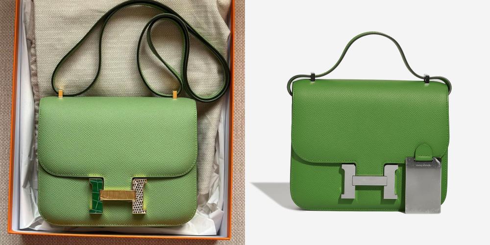
Photographing Difficult Hermès Colors
Some colors consistently challenge cameras.
Gold and Etoupe
These shades reflect surrounding colors easily.
- Use neutral backgrounds
- Avoid warm indoor light
- Double-check white balance
Reds and Pinks
Cameras often oversaturate reds.
- Lower exposure slightly
- Avoid direct sunlight
- Watch saturation carefully in editing
Blues and Greens
These shift dramatically with light temperature.
- Stick to daylight only
- Never mix light sources
Adding a Color Reference for Trust
Including a neutral reference object increases credibility.
Good options include:
- Gray card
- Plain white cotton cloth
- Kraft paper
This gives viewers a visual anchor and reassures them that the color has not been manipulated.
Editing for Accuracy, Not Aesthetic Style
Editing should correct errors, not create a mood.
Acceptable Adjustments
- White balance correction
- Minor exposure tweaks
- Light shadow recovery
Avoid These Changes
- Filters or presets
- Saturation boosts
- Texture or clarity sliders
- Heavy sharpening
If the edited image looks “better” than the bag in real life, it is probably less accurate.
Cross-Checking Before Final Use
After editing:
- Compare the photo to the bag in natural light
- View the image on multiple screens
- Watch for overly warm or cool tones
Phone screens often display more saturation than laptops, so check both if possible.
Organizing Photos for Records or Insurance
Clear documentation adds long-term value.
Best practices:
- Include bag name and date in file names
- Keep original RAW files
- Store edited versions separately
- Back up files in multiple locations
Well-organized records make insurance claims and resale much easier later.
Common Mistakes That Ruin Color Accuracy
Avoid these common issues:
- Shooting at night under lamps
- Using flash directly on the bag
- Photographing on white bedding
- Applying social media filters
- Relying on full auto mode
Most color problems come from these simple mistakes, not from lack of expensive equipment.
A Simple, Repeatable Photography Setup
Consistency matters more than perfection.
A reliable setup looks like this:
- Neutral matte background
- Indirect daylight from one window
- Manual or daylight white balance
- Slight underexposure
- One flat lay, one upright, one close-up
Using the same setup each time builds trust and makes your photos comparable over years.
Final Thoughts
Photographing Hermès bags true to color is about restraint and control. The goal is not to make the bag look dramatic, trendy, or editorial. The goal is honesty. When lighting, background, and settings are handled carefully, the bag speaks for itself.
Accurate photos protect your investment, support fair resale, and create records you can rely on long after the bag changes hands. With a simple setup and a consistent process, you can capture Hermès leather the way it actually looks in real life.